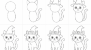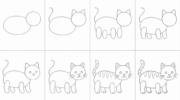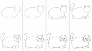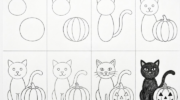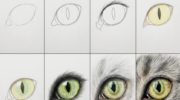
If you’ve ever scrolled through Pinterest and thought “wait, how is that the same medium as that?” — yeah, me too, all the time. There’s a TikTok format you’ve probably seen: an artist draws the same character in four different styles in one video. Same subject. Same paper. Four entirely different drawings.
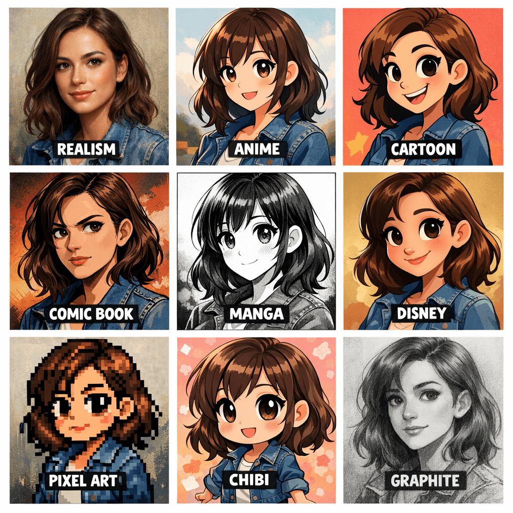
That’s what this guide is. A visual map of how the same act — making marks — branches into dozens of distinct languages. I’ll walk you through 18 major drawing styles people actually search for, with what they look like, where they came from, and how to start. After that, you’ll find a longer list of around 100 more styles for when the rabbit hole calls. And at the very end, an FAQ section with the questions I get the most.
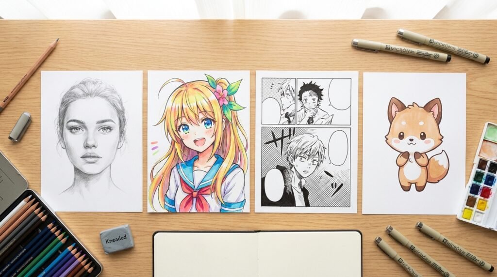
This page is going to keep growing. If your favorite style isn’t covered yet, drop a comment — I’ll add it.
1. Realism
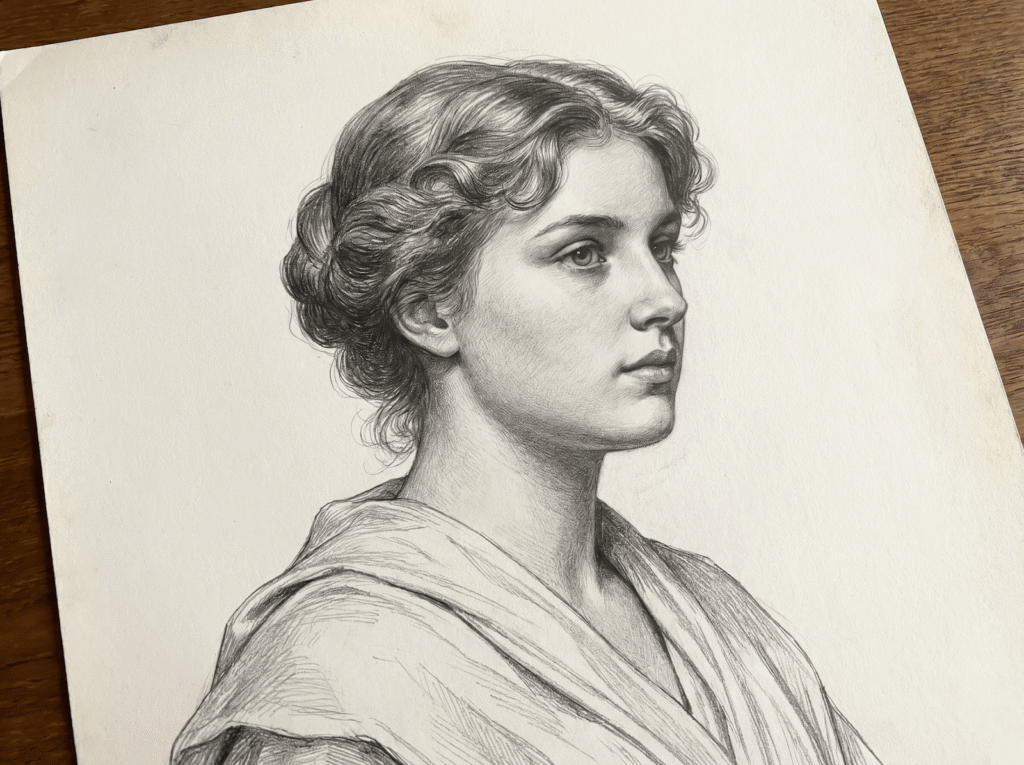
Realism is the foundation. Before any of the other styles on this list became “styles,” they were variations on this one core idea: draw what you actually see, with accurate proportions and natural light. Sit it next to hyperrealism (next section) and you’ll spot the difference — realism doesn’t try to fool your eye, it just renders honestly.
The classical training around realism is centuries old. The atelier method, sight-size measuring, Bargue plates — these all teach you to compare angles, measure distances, and translate three dimensions onto a flat surface. If you’ve ever wondered why old portrait drawings look so calm and grounded, that’s the answer: the artist worked from observation, slowly.
To try realism: pick one object on your desk — a mug, an apple, your phone — and a single light source. Use two pencils (HB and 4B is enough). Spend twenty minutes drawing it without measuring with a ruler. Then check: are the proportions off? Where’s the shadow weakest? That gap between what you saw and what you drew is exactly the muscle realism trains.
I trained in this style at Kline Academy for two years before I let myself get fancy. Honestly, every realism exercise I did then still pays dividends now. Skip it and your other styles will lean a little wonky forever.
2. Hyperrealism (Graphite)
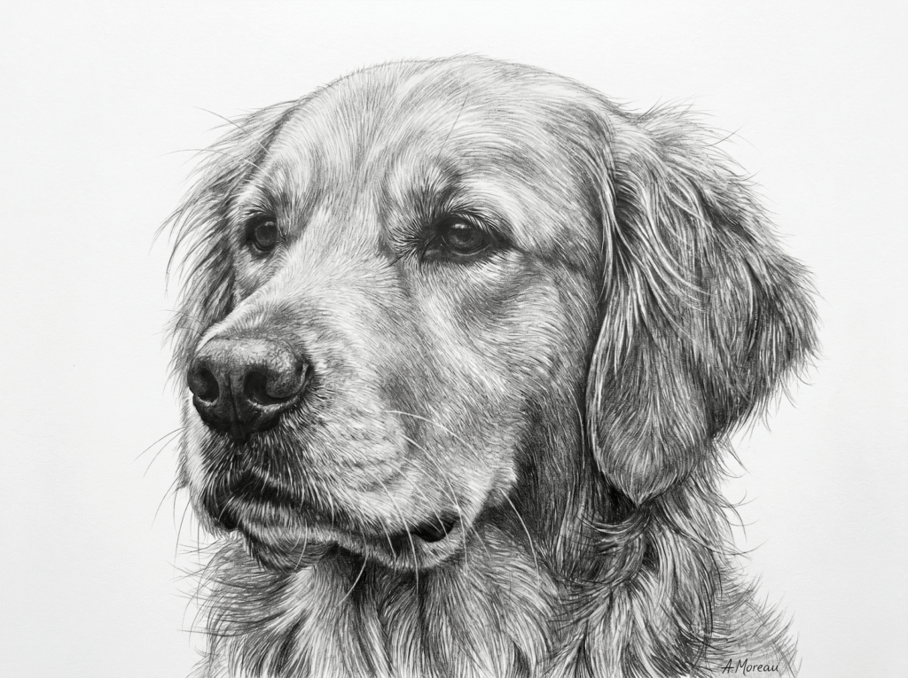
Hyperrealism in graphite is what happens when you take a regular pencil drawing and crank the patience dial up to eleven. The goal is photographic illusion — fur, skin, fabric, eye reflections — all built from thousands of tiny graphite marks. The style took off in the 1960s alongside photorealism in painting, and it has its own modern stars now: Cole McNair, Diego Koi, Kelvin Okafor.
What makes a drawing read as hyperreal isn’t a single magic technique. It’s the full tonal ladder. Most beginners use three or four pencils; hyperreal artists move through ten or more grades, from 9H (a feather-light silver) all the way to 8B (a velvety black). Every centimeter of the paper has been worked over with crosshatching, blending stumps, kneaded erasers lifting tiny highlights, and Mono Zero erasers carving back individual hairs.
If you want to try it: start with a smooth bristol board (textured paper will fight you), a Faber-Castell 9000 set or a Staedtler Mars Lumograph set, and a single high-detail reference photo. Don’t try a full portrait first. Pick one square inch of fur or one eye, and spend two hours on it. That single square inch will teach you more about value than any tutorial.
I spent close to two years just on shading hierarchy before my realism started clicking. If yours doesn’t click in week one, that’s normal. Trust me, this was me.
3. Cartoon
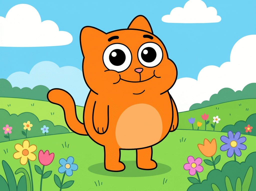
“Cartoon” is the broad umbrella for any drawing style designed to be funny, expressive, and instantly readable. Big head, small body. Eyes that bug out when something surprising happens. Bold black outlines. Flat colors. Western cartooning has its own family tree — Tex Avery, Hanna-Barbera, Disney’s TV side, then the modern wave that runs through The Simpsons, SpongeBob, Adventure Time, Bob’s Burgers, and The Amazing World of Gumball.
The technical core is simplification. A cartoonist looks at a real face and asks “what is the absolute minimum I need to draw to make this person recognisable?” Two dots and a line. Maybe a bracket-shaped nose. The economy is the whole point. Once you can simplify, you can exaggerate — and exaggeration is where the comedy lives.
To try cartoon style: grab a sharpie or any thick black pen and a sheet of printer paper. Draw your friend’s face in 30 seconds without lifting the pen too much. Push everything that’s already prominent — bigger nose, taller hair, more chin. Don’t aim for accuracy, aim for “ah, that’s definitely them.” That instinct is the whole skill.
Cartoon was the first style I drew obsessively as a kid. My math notebooks were 90% cartoon faces and 10% homework. Sorry, Mrs. Halverson.
4. Anime
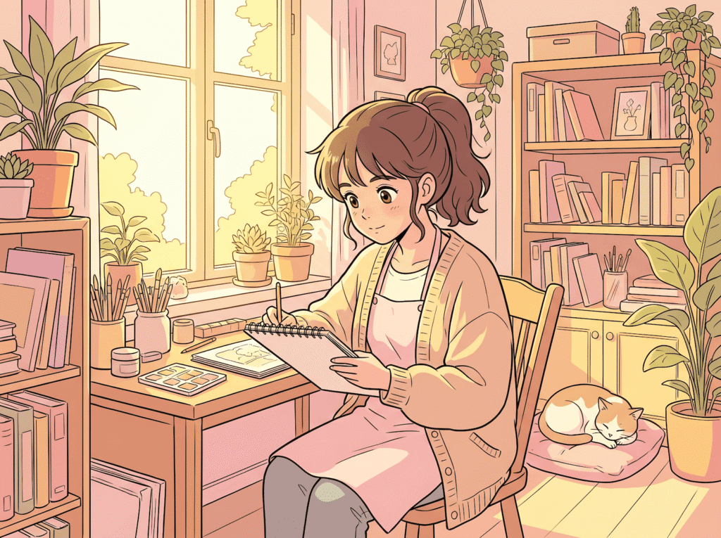
Anime sits on the opposite end of what graphite hyperrealism is doing. Where hyperrealism wants you to forget you’re looking at a drawing, anime wants you to feel something instantly — and uses simplification to get there. Big eyes, simplified noses, hair drawn as bold shapes rather than individual strands, dynamic poses pushed past anatomical accuracy on purpose.
The lineage runs through Osamu Tezuka in the 1950s (the godfather of modern anime and manga), then opens up — Akira, Sailor Moon, Naruto, the entire Studio Ghibli catalog, and a huge online community of self-taught artists posting daily on Instagram and TikTok. The style has split into many substyles: shōnen (action-driven), shōjo (softer, romance-leaning), seinen (adult, often gritty), chibi (deliberately cute and tiny), and the soft Ghibli-influenced look you see all over modern children’s books.
The technical side is friendlier than people expect. Clean line art is the foundation — usually drawn with a dip pen, brush pen, or digitally with a stabilized pen tool. Color is applied in flat blocks (cel-shading), with one or two shadow tones layered on top. No need for ten pencil grades.
I don’t draw anime myself — my comfort zone is graphite portraits — but I’ve spent time studying the line economy, and the first thing I learned is that simplification is harder than detail. Every line has to do real work because there are so few of them.
5. Manga
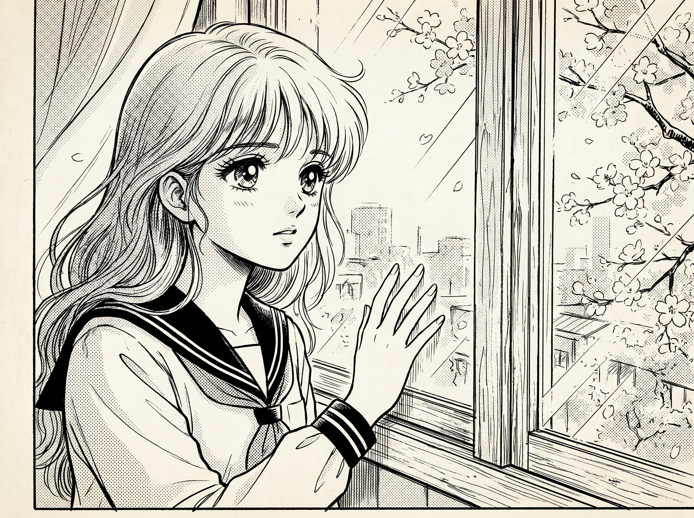
People often use “anime” and “manga” interchangeably, but they’re slightly different things. Anime is animation; manga is the comic book it’s usually based on. Visually, manga has its own constraints because it’s almost always printed in black and white. So instead of color, you get screentones — those dotted gray patterns layered over a panel to imply skin, fabric, sky, motion blur. It’s an entire visual vocabulary the moment you stop using color.
Modern manga branches by demographic: shōnen for boys, shōjo for girls, seinen for adult men, josei for adult women, plus genres within each. Eiichiro Oda’s One Piece, Naoko Takeuchi’s Sailor Moon, Junji Ito’s horror, Inio Asano’s slice-of-life — all manga, all with wildly different visual personalities while still sharing a recognisable family resemblance.
To try manga: get a Pigma Micron or Pentel pocket brush pen, white drawing paper, and a sheet of screentone (or a digital screentone library if you work on a tablet). Draw a single panel — just one. Outline cleanly with the pen, then layer screentone in the shadow areas. Resist the urge to add color. Manga’s discipline is what gives it that iconic feel.
If you grew up reading manga, drawing it is like learning to write your second language by hand. The grammar’s already in your head — your hand just has to catch up.
6. Comic Book
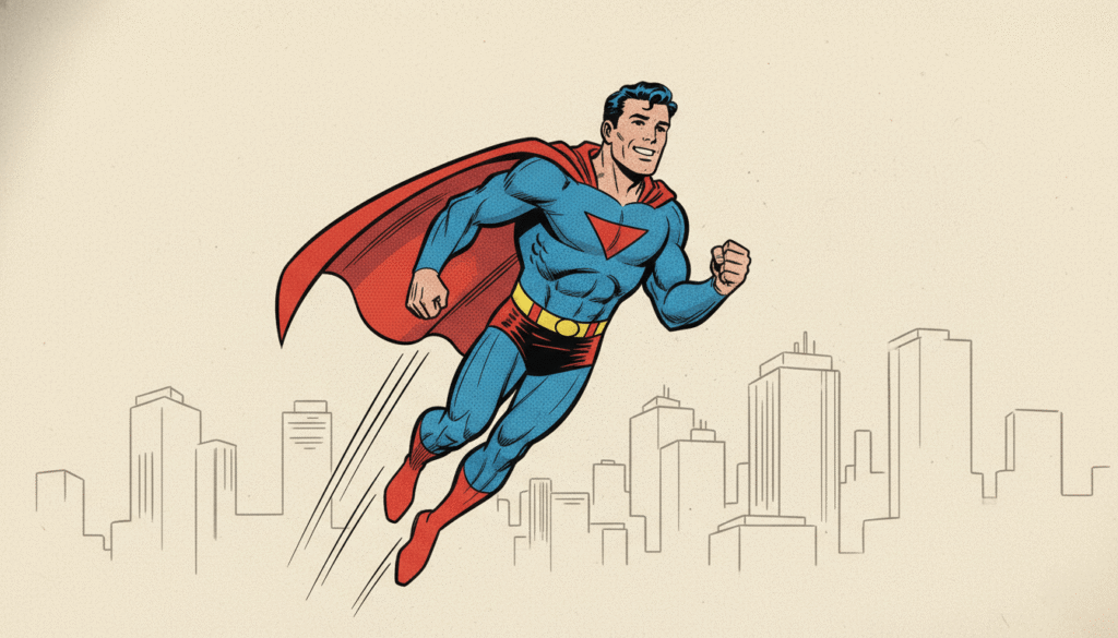
If manga is the Japanese answer to sequential storytelling, comic book is the American (and European) one. The style is older — going back to early 20th century newspaper strips and the 1930s Golden Age of superheroes — and it has a completely different visual signature. Bold ink outlines. Color from the start, not as an afterthought. Dramatic camera angles. Halftone Ben-Day dots that gave the printed page its characteristic texture.
Two big lineages exist inside it. The American superhero school — Jack Kirby, Steve Ditko, Frank Miller, Jim Lee, Skottie Young — leans dynamic, exaggerated, kinetic. The European school, especially the French-Belgian bandes dessinées tradition (Tintin, Asterix, Moebius), leans cleaner, more illustrated, often softer in tone. Underground and indie comics (Robert Crumb, Daniel Clowes, Marjane Satrapi) form a third branch entirely.
To try the style: pick a single moment of action — someone catching a falling glass, a punch landing, a dog jumping — and stage it in one panel. Use a thick brush pen for outlines, a thinner pen for details, and limit yourself to four colors. Push the camera angle. Comic style rewards drama; it punishes flat compositions.
The first time I tried comic-style inking I overworked it for hours. The trick is the opposite of hyperrealism — you have to commit fast, then move on.
7. Sketch
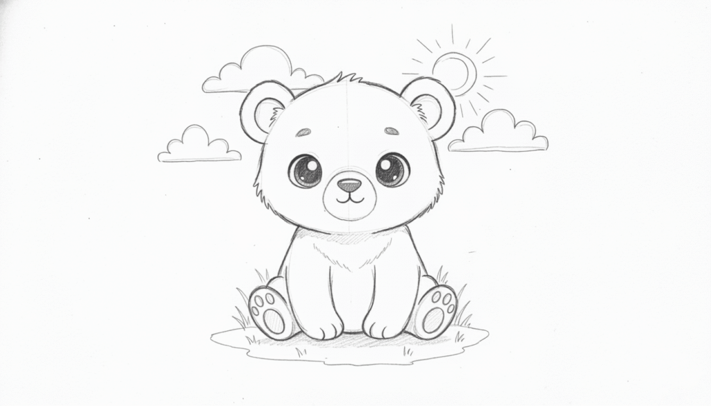
“Sketch” is one of those words that’s done a lot of work over the centuries. Originally it just meant a quick study — preliminary marks before a “real” painting. But in the last fifty years, sketch has become a finished style in its own right. The looseness is the point. Construction lines stay visible. Mistakes don’t get erased. Energy beats accuracy.
This style lives where modern illustration meets urban sketching, life drawing studios, and the swelling Instagram crowd of artists posting their morning coffee shop drawings. Look up Lapin, Liz Steel, Felix Scheinberger, Marc Taro Holmes — different voices, all working in this space.
To try sketching: get a softcover sketchbook (something you don’t feel precious about), a single pencil or fineliner, and twenty minutes a day. Draw whatever’s in front of you. Don’t erase. If you make a mistake, draw the next line over it and keep going. The “ugly” sketchbook is the one that grows you the fastest. The pretty one tends to stay small.
I keep three sketchbooks at once. One I’m proud of, one I draw badly in on purpose, and one for studies. The badly one is the one I learn from most.
8. Line Art
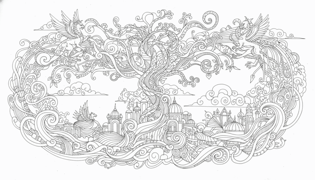
Line art — no shading, no color, just confident contour. Modern editorial favorite.
Line art is the style that has quietly taken over modern editorial illustration, brand identity, and tattoo culture all at the same time. The rules are minimal: a single black line on a white background, no shading, no fill. Sometimes a single accent color. The challenge is that every line has to be right the first time — there’s nothing else hiding the work.
Two flavors exist within it. Continuous line is exactly that — one unbroken stroke from start to finish, often without lifting the pen. It’s the version you see on Instagram in a four-second time-lapse video. Single-line tattoos are continuous-line drawings sized down. The other flavor is variable-weight line art, where the line thickens and thins to imply form and depth (Aubrey Beardsley made a career out of it in the 1890s; Quentin Blake and Jean-Jacques Sempé have built on it since).
To try line art: a fineliner pen (Sakura Pigma Micron 03, Staedtler Pigment Liner) and white paper. Pick a simple subject — a face, a flower, a chair — and draw it in one continuous line. Yours will look messy at first. Do twenty in a row. Number eighteen will start looking like a real drawing.
Line art is deceptively hard. There’s no shading to bail you out — the line has to do all the work. Two minutes per drawing, twenty drawings a day, was how I trained mine.
9. Cute / Kawaii / Chibi
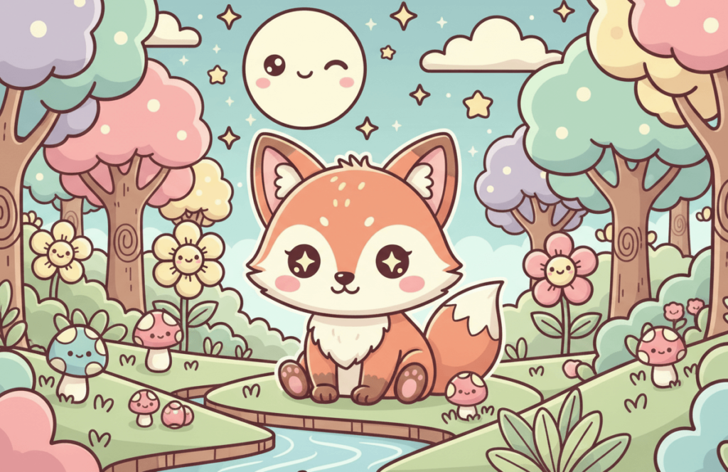
“Cute” looks effortless. It’s actually one of the most engineered styles on this list. Characters are built around tight visual rules: oversized head (sometimes half the body), tiny limbs, exaggerated round eyes, simplified noses (often just a dot), pastel palettes that lean pink, mint, lavender, peach. The Japanese term kawaii covers the broader aesthetic, while chibi (“super deformed”) describes the squashed proportions specifically.
The cultural lineage runs through Sanrio (Hello Kitty, 1974), then anime side-stories where serious characters get drawn in chibi proportions for comedic effect, then a global wave through stickers, app icons, plushies, and the entire LINE/Kakao messenger sticker economy. Modern Western cute illustration borrows heavily from this — most “cute” Etsy listings are operating inside a kawaii visual grammar whether the artist knows it or not.
To try cute style: lock in your proportions first. Head two times the body height (sometimes more for full chibi). Eyes the size of the mouth. Limbs short and rounded. Color in pastels — under-saturate everything until it feels candy-soft. Then add one or two charm details: a blush, a sparkle, a tiny accessory.
I drew so many chibi characters in middle school they completely retrained how I see proportions. To this day I have to consciously stretch faces to get back to realistic adult proportions.
10. Disney Style
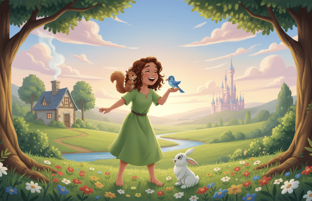
Disney style is its own visual species, distinct from anime, distinct from generic Western cartoon. The roots go back to Walt Disney’s pursuit of “the illusion of life” — characters whose anatomy is simplified but whose movement and emotion read as real. Frank Thomas and Ollie Johnston laid out the rules in The Illusion of Life: Disney Animation, and those rules — squash and stretch, anticipation, follow-through, exaggeration with restraint — still drive most of contemporary 2D animation.
Visually, the Disney face has its own template. Round head, big eyes set wide apart, button nose, soft jaw. Backgrounds are painterly and warm rather than flat. Colors stay saturated but never harsh. The Renaissance era (Little Mermaid through Tarzan) is the most studied because it’s where character design hit a peak before 3D took over.
To try Disney style: grab Preston Blair’s Cartoon Animation (still the standard reference) and copy his construction breakdowns. The shortcut isn’t a shortcut — you have to draw simplified heads from many angles until the proportions feel like they belong to one character. Then stage that character with clear body language. The body always has to communicate the emotion before the face does.
I’m not an animator, but the Disney drawing exercises taught me more about appeal — that hard-to-define quality that makes a character magnetic — than any pure realism class did.
11. Studio Ghibli Style
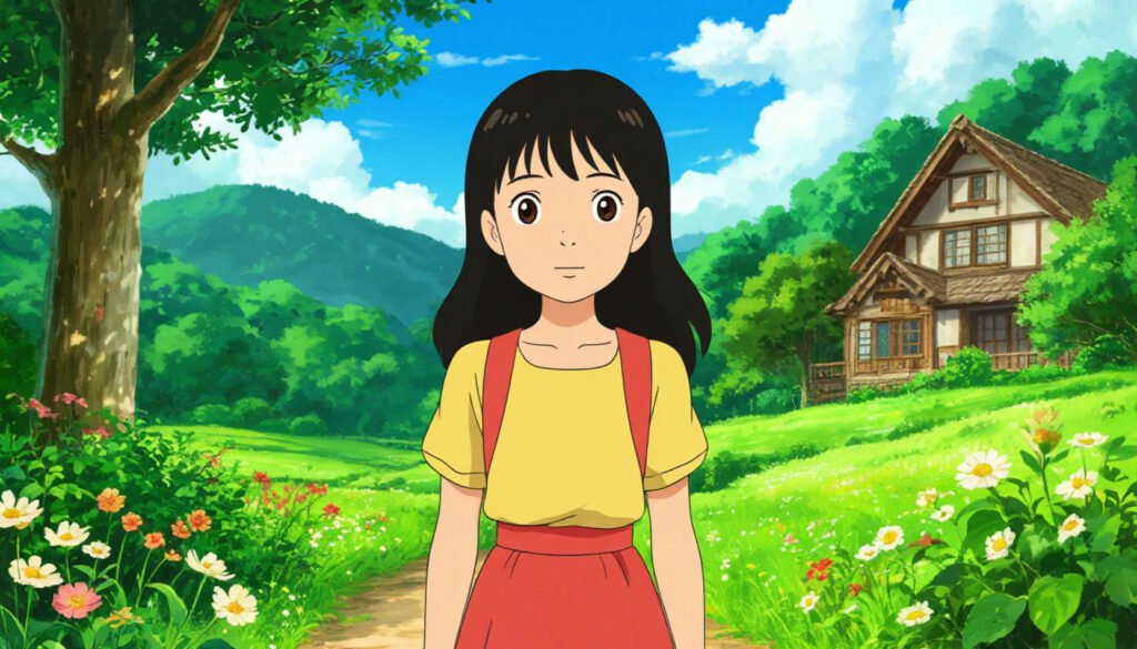
Studio Ghibli is technically a subset of anime, but the style is so distinctive (and so heavily searched separately) that it earns its own section. Founded by Hayao Miyazaki and Isao Takahata in 1985, Ghibli built a visual identity around painted backgrounds that look like watercolor, character designs softer than mainstream anime, slow pacing that lets you linger on the environment, and a quiet attention to mundane details — wind moving through grass, food being prepared, light falling through a kitchen window.
What makes Ghibli drawings recognisable up close: rounder faces and softer eyes than typical anime, restrained line work, a lot of negative space, and color palettes that stay in a narrow gentle range — never neon, never harsh. The backgrounds often outshine the characters in screen time. Studying any frame from My Neighbor Totoro or Spirited Away is a masterclass in watercolor composition.
To try a Ghibli-influenced approach: work small (postcard size), use real watercolor or a soft digital brush, and spend more time on the environment than the character. Light is the secret ingredient. Pick a time of day — golden hour, overcast morning, soft afternoon — and let it tell most of the story.
If I’m honest, this is the style I retreat to when I’m tired. Ghibli paintings make me want to draw in a way nothing else does.
12. Sumi-e (Japanese Ink Wash)
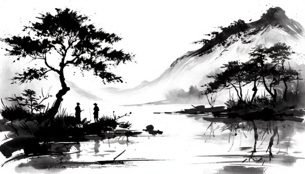
Sumi-e is the Japanese tradition of ink wash painting, brought from China around the 14th century along with Zen Buddhism. The toolkit is austere: one brush, one ink stick (ground on a stone with water), one sheet of rice paper. The discipline is even more austere — every stroke is permanent. There’s no erasing, no layering on top, no second chances. The paper accepts the line or it doesn’t.
Classic subjects are the “Four Gentlemen”: orchid, bamboo, plum, chrysanthemum — each one chosen because mastering it requires a specific brush technique. Bamboo teaches confident vertical strokes. Orchid teaches gentle curves. Plum blossom teaches dotting. The whole tradition treats drawing as a meditative practice as much as an artistic one.
To try Sumi-e: a basic Sumi brush set runs about $20–30, and any absorbent paper works for practice (rice paper if you can find it, watercolor paper otherwise). Hold the brush vertical, not at an angle. Load it with ink, dip the tip in water for a soft transition, and draw a single bamboo stalk in one breath. You’ll want to add more strokes. Don’t. The discipline of stopping is what the style teaches.
Sumi-e completely rewired how I think about pencil pressure. Once you’ve internalized “one stroke, no edits,” every other medium feels generous.
13. Pen and Ink
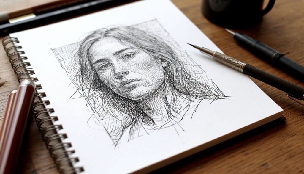
Pen and ink covers an enormous range — from quick fineliner sketches to densely cross-hatched illustrations that took weeks to finish. The shared element is the medium: black ink, applied with a nib pen, brush, or modern technical pen, on white paper. There’s no eraser. Value comes from how dense you stack tiny marks on top of each other.
The style has a long history: Albrecht Dürer’s 16th-century engravings, Aubrey Beardsley’s late-Victorian decadence, Edward Gorey’s macabre Victorian-flavored books, the entire New Yorker illustration tradition, modern artists like Iain Macarthur or Vince Low. The visual range is huge but the technical core stays the same — hatching, cross-hatching, stippling, contour line, all in the same color of ink.
To try pen and ink: get a Sakura Pigma Micron set (they come in a range of nib sizes from 005 up to 08) and smooth bristol or even printer paper. Pick a high-contrast subject — a tree, an old building, a piece of fruit. Don’t outline first. Start in the darkest shadow and build up density there, then move outward. The drawing will reveal itself like a developing photo.
This is the style I teach people who tell me they “can’t draw because they can’t shade.” Pen and ink doesn’t ask you to blend — it asks you to be patient with patterns. Different muscle, easier to grow.
14. Charcoal
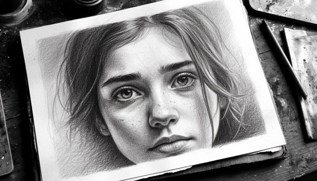
Charcoal is graphite’s louder cousin. It’s blacker (a true matte black instead of graphite’s silvery gray), faster (you can lay down a full mid-tone in a single stroke), and more atmospheric (it smudges into soft, painterly transitions). Portrait artists love it for its drama; figure-drawing studios love it for its speed.
The medium has three main forms: vine charcoal (soft, smudgy, easy to lift), compressed charcoal (denser, blacker, harder to erase), and charcoal pencils (more controllable for fine detail). Combine all three in one drawing and you can move from atmospheric mid-tones to crisp accents without switching supplies. The historical lineage runs through Käthe Kollwitz, William Kentridge, and pretty much every art school’s first-year figure-drawing class.
To try charcoal: a small starter set, newsprint pad (cheap, designed for charcoal), and a kneaded eraser. Cover the whole sheet with a mid-tone wash first by rubbing vine charcoal on with your fingers. Then use the kneaded eraser to lift out highlights and the compressed charcoal to push in shadows. Working subtractively this way feels like sculpting — closer to clay than to pencil.
Charcoal is the medium I reach for when I need to break out of stiff drawing. After hours on a tight graphite portrait, a fast 30-minute charcoal session resets my hand completely.
15. Pop Art
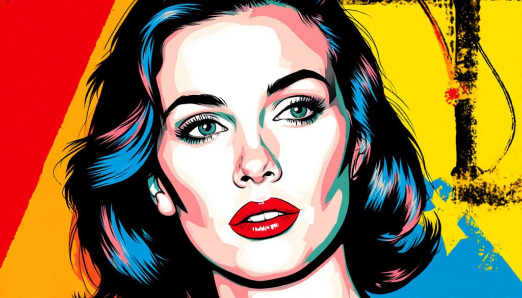
Pop art emerged in the late 1950s and exploded in the 1960s as a deliberate response to abstract expressionism. Where abstract painters were chasing the sublime, pop artists pulled imagery straight from advertising, comic books, soup cans, and celebrity photos. The visual language borrowed everything from commercial print: halftone dots, screen-printed flat color, repeating panels, bold outlines. Andy Warhol, Roy Lichtenstein, Keith Haring, James Rosenquist — different artists, same shared vocabulary.
What makes a drawing read as “pop art” today: hard outlines, screen-printed-looking flat color (sometimes intentionally misregistered), references to mass media, repetition or grid layouts, and color choices that lean punchy and high-contrast. The style has aged into something instantly nostalgic — pop art now reads as 1960s the way Art Nouveau reads as 1900s.
To try pop art: pick a single iconic image — a famous face, a logo, a piece of food — and reproduce it four times in a 2×2 grid, each one in a different bold color combination. Use markers or flat digital fills, no gradients. Add a halftone texture overlay if you have one. The point isn’t accuracy, it’s repetition with variation.
Pop art is the most fun to draw on a slow studio day. It bypasses the perfectionist part of my brain entirely.
16. Pixel Art
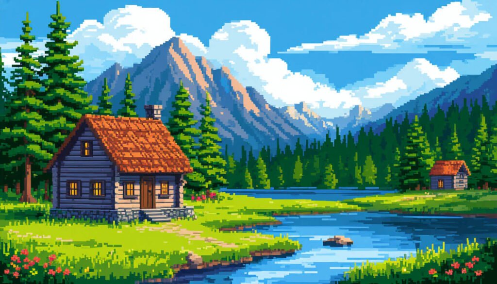
Pixel art was born from a hardware constraint. Early game consoles couldn’t display many colors or much resolution, so artists worked at tiny grid sizes — 8 bits, 16 bits — placing each pixel by hand. The constraint became a craft. By the late 1990s, when bigger screens and richer palettes arrived, pixel art could have died. Instead it became a deliberate aesthetic. Modern indie games (Stardew Valley, Celeste, Octopath Traveler) use pixel art on purpose because the limitation creates a specific kind of charm.
The style has its own internal rules: limited color palettes (often 16 or 32 colors total), no anti-aliasing along edges (or carefully manual anti-aliasing), readable silhouettes at tiny sizes, and animation done frame-by-frame on a small grid. Sub-styles include 8-bit (NES era, very low color), 16-bit (SNES/Genesis, richer), 32-bit (PlayStation 1 era), and modern hybrid styles that mix higher resolution with pixel-art rules.
To try pixel art: skip paper entirely. Download Aseprite ($20, the standard) or use the free Piskel in your browser. Start at 32×32 pixels and a 16-color palette — the limitations are the whole point. Draw a single character, head only, one frame. The first one will look wrong. The eighth will start clicking. Pixel art rewards reps.
Pixel art is the only style on this list where I’d argue digital is mandatory. Trying to do it on paper completely misses the medium.
17. Concept Art
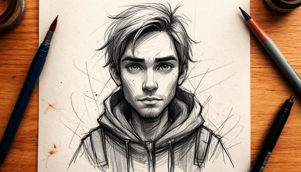
Concept art is the style behind nearly every fantasy and sci-fi visual you’ve ever loved. Before a film, game, or animation gets built, concept artists figure out what its world, characters, vehicles, and creatures look like. The work is both technical (you have to draw a thing precisely enough that someone else can build it in 3D) and atmospheric (you have to make the whole thing feel like a place worth visiting).
Visually, concept art tends to be painterly rather than line-based. Big, fast brush strokes for environments. Strong silhouettes for character design. Mood lighting and atmospheric perspective. Names like Iain McCaig (Star Wars), Craig Mullins (everything), Ian McQue (Rebellion), Ryan Lang (Marvel) — these are the artists working at the top of the field. Almost all of it is digital these days, painted in Photoshop, Procreate, or Krita.
To try concept art: pick a single environment — “abandoned underwater research station,” “desert outpost at sunset,” “cottage at the edge of a haunted forest.” Block in the entire image with three values (light, mid, dark) before adding any color. Then add atmosphere (fog, dust, glow) before any detail. Detail is the last thing you add, and only in the focal area.
This is the style I most admire and least practice. Every time I open a concept art book I get inspired and intimidated in roughly equal measure.
18. Children’s Book Illustration
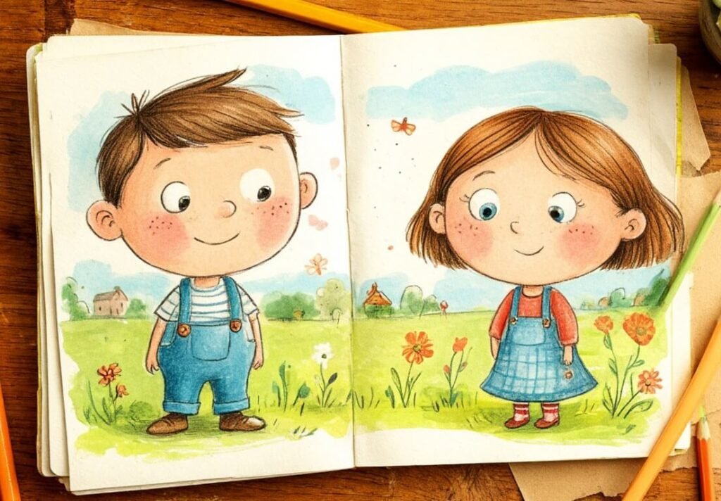
Children’s book illustration has its own visual logic shaped entirely by audience. The reader is a child between ages 2 and 8, often sitting on a parent’s lap. So the artwork has to be readable across the room, emotionally clear at a glance, and — this is the key one — capable of carrying a story across 32 pages without getting boring. The illustrators who do this well (Beatrix Potter, Eric Carle, Maurice Sendak, Oliver Jeffers, Jon Klassen, Christian Robinson) are some of the most quietly skilled artists working anywhere.
The style isn’t one style — it’s a family. Warm watercolor (Beatrix Potter), torn-paper collage (Eric Carle), expressive line drawings (Quentin Blake), restrained gouache (Jon Klassen), digital flat color (much of contemporary picture books). What ties them together is approach: limited palettes, character-first compositions, scenes that feel like single moments rather than cluttered illustrations.
To try children’s book illustration: pick a 32-page format (it’s the industry standard) and outline a tiny story in five sentences. Now draw five thumbnails — one per major moment. Don’t aim for finished illustrations; aim for reading clarity. The constraint of telling a story in pictures sharpens visual thinking faster than almost any other exercise.
Children’s books are the form I most want to work in someday. The bar is high in a way most people don’t realize until they try to make one.
100 more drawing styles to explore
The eighteen above are the ones with the most search demand and the clearest visual identities. Below is a longer roster — every entry is a real, distinct drawing style, and any of them could become its own deep-dive article. I’ll add proper sections for these as the guide grows. If one jumps out at you, drop a comment and I’ll prioritize it.
By art-historical period
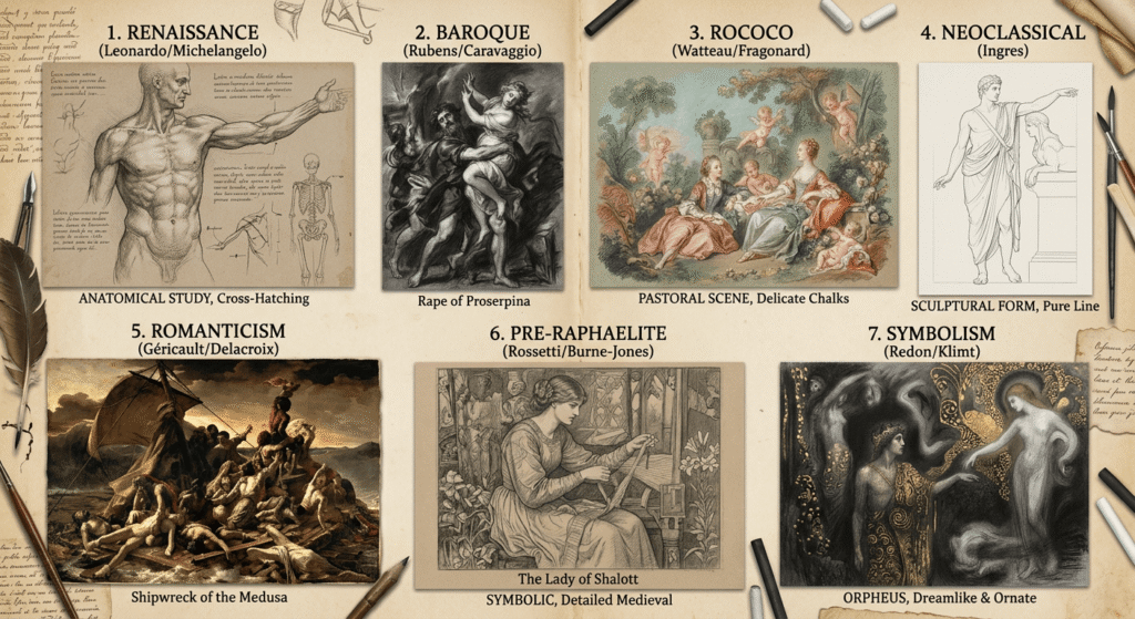
- Renaissance drawing — Leonardo, Michelangelo. Anatomical study, silverpoint, cross-hatching as form.
- Baroque drawing — Rubens, Caravaggio. High drama, deep shadow, theatrical light.
- Rococo — Watteau, Fragonard. Delicate, decorative, soft pastels.
- Neoclassical drawing — Ingres. Pure line, restrained, sculptural figures.
- Romanticism — Géricault, Delacroix. Emotion-driven, dramatic, often dark subject matter.
- Pre-Raphaelite — Rossetti, Burne-Jones. Detailed, symbolic, medieval-inspired.
- Symbolism — Redon, Klimt drawings. Dreamlike, mythological, ornate.
Modern movements
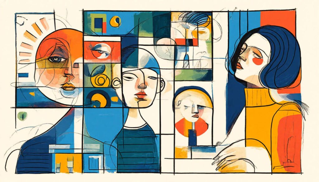
- Impressionism — Loose, light-driven, brushy. More common in painting but has a strong drawing tradition (Degas).
- Post-Impressionism — Van Gogh’s reed-pen drawings, structured mark-making.
- Pointillism — Seurat. Color and form built from tiny dots.
- Fauvism — Bold non-naturalistic color, simplified shapes.
- Cubism — Picasso, Braque. Multiple viewpoints in one image, fragmented form.
- Futurism — Motion captured through repeated overlapping forms.
- Dadaism — Anti-art, collage, absurdity.
- Surrealism — Dalí, Magritte. Dream logic, impossible imagery.
- Abstract expressionism — Pollock, de Kooning. Gesture, emotion, no figurative content.
- Minimalism — Reduction to essential forms, often geometric.
- Op art — Bridget Riley. Optical illusions, repeated patterns.
- Kinetic art — Implied or actual movement.
- Psychedelic — 1960s, swirling forms, vibrant clashing color.
- Naïve art — Henri Rousseau. Untrained, flat, charming.
- Outsider art — Self-taught, often raw or obsessive.
- Lowbrow / Pop Surrealism — Mark Ryden, Camille Rose Garcia. Cute meets unsettling.
By medium
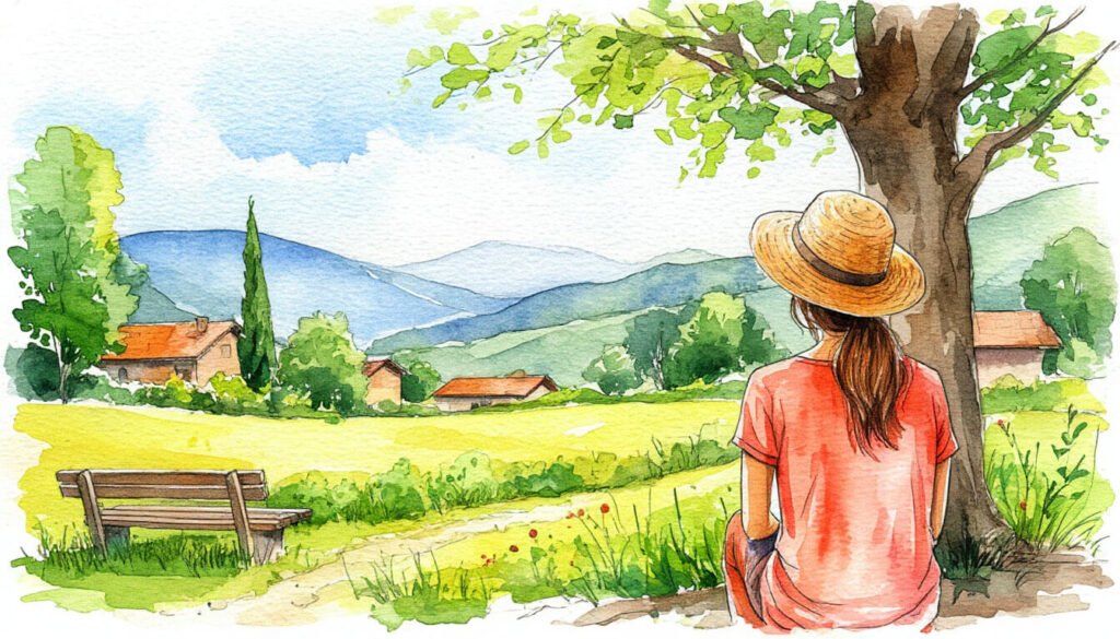
- Watercolor sketching — Loose washes combined with line.
- Pastel — Soft pastels (Degas, Mary Cassatt) or oil pastels (Picasso). Buttery, blendable color.
- Crayon — Wax-based, often used for kid-style or naïve looks.
- Marker illustration — Copic markers, alcohol-based, layered for blends.
- Color pencil — Layered color, capable of near-painting realism.
- Scratchboard — White lines scratched into a black-coated board. High contrast.
- Silverpoint — A silver stylus on prepared paper. Old-master technique.
- Woodcut — Print made from a carved wood block.
- Linocut — Carving and printing from linoleum.
- Etching — Acid-etched metal plate, printed.
- Engraving — Cut directly into metal or wood.
- Lithograph — Drawn on stone with grease, printed.
- Monoprint — One-off print made by transferring drawn marks.
Cultural traditions
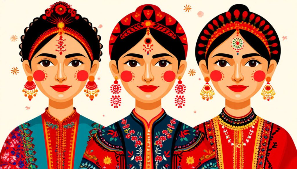
- Persian miniature — Detailed, flat, ornate, often illustrated manuscripts.
- Mughal miniature — Indian-Persian fusion, jewel-like detail.
- Madhubani — Bihar, India. Geometric, mythological, intense pattern.
- Warli — Maharashtra, India. White figures on red-brown backgrounds.
- Kalamkari — Hand-painted Indian textile drawing tradition.
- Tibetan thangka — Religious scroll painting. Highly codified.
- Chinese ink (Shuǐmò) — Older sibling to Sumi-e. Landscapes, scholar painting.
- Ukiyo-e — Japanese woodblock prints. Hokusai’s wave is the most famous.
- Korean Minhwa — Folk paintings, bright, symbolic.
- Aboriginal dot painting — Australian Indigenous tradition, dots arranged into stories.
- Native American ledger art — Plains tribes, on found ledger paper.
- Inuit prints — Cape Dorset tradition, animals and folklore.
- Egyptian wall art style — Profile views, hieratic scale, flat color.
- Byzantine icon — Religious, gold leaf, frontal figures.
- Russian icon — Eastern Orthodox tradition, similar codification.
- Mexican folk (alebrije) — Brightly colored fantastical creatures.
- Polynesian tattoo — Geometric, ancestral, body-mapped.
Modern subcultures and aesthetic genres
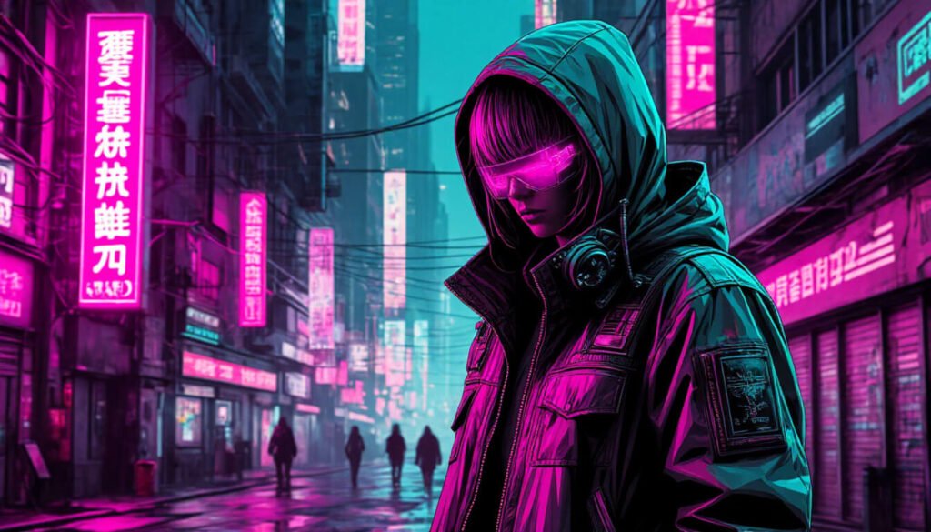
- Cyberpunk — Neon, dystopian, tech-noir.
- Steampunk — Victorian + machinery + brass.
- Dieselpunk — Interwar industrial aesthetic.
- Vaporwave — 1990s nostalgia, pastel, classical statues, glitch.
- Synthwave — 1980s neon grids, retro-futurism.
- Y2K aesthetic — Late 90s / early 2000s, glossy, chrome, frosted.
- Memphis design — 1980s Italian, geometric, clashing patterns.
- Cottagecore illustration — Romantic rural, soft palette, herbs and mushrooms.
- Dark academia illustration — Moody library, brown palette, classical references.
- Y2K street style — Bold graphics, low-fi.
- Goth illustration — Black, ornate, Victorian-influenced.
- Grunge — Distressed, layered, raw textures.
Decorative and pattern-based
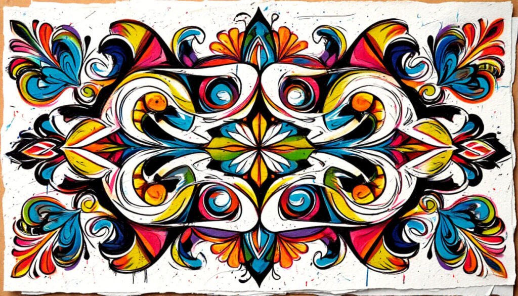
- Mandala — Symmetrical circular pattern, meditative drawing.
- Zentangle — Repetitive abstract patterns inside small grids.
- Doodle — Casual, often unconscious mark-making.
- Calligraphy — Letters as drawing.
- Lettering / hand-lettering — Decorative letterforms drawn rather than written.
- Graffiti — Wildstyle tags, street pieces, throwies.
- Street art — Banksy-style stencils, paste-ups, public murals.
- Mosaic style — Drawing imitating tiled compositions.
- Stained glass illustration — Bold black outlines + flat colored sections.
- Silhouette — Solid black profile, classical and modern.
- Art Nouveau — Mucha, Beardsley. Flowing organic curves.
- Art Deco — Geometric, glamorous, 1920s.
Technical and approach-based
- Cross-hatching — Shading via crossed parallel lines.
- Hatching — Single-direction parallel-line shading.
- Stippling — Shading made entirely of dots.
- Gesture drawing — Quick figure capture, energy over accuracy.
- Continuous line — One unbroken stroke from start to finish.
- Blind contour — Drawing without looking at the paper.
- Notan — Two-value (black and white) shape design.
- Negative space drawing — Drawing the air around the subject.
- Perspective drawing — One-, two-, three-point construction.
- Isometric — Equal-angle 3D projection. Architectural and game art favorite.
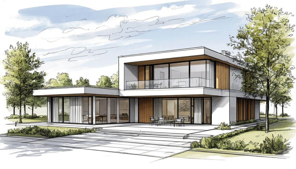
- Architectural rendering — Buildings, plans, elevations.
- Wireframe — Skeletal 3D-style line construction.
- Vector illustration — Built from clean shapes, infinitely scalable.
- Flat design — No shadows, no gradients, just color and shape.
Subject-specialized illustration
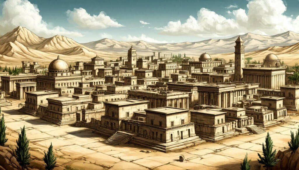
- Botanical illustration — Scientific accuracy, beautifully rendered plants.
- Scientific / medical illustration — Anatomy and process, precision-driven.
- Storyboard art — Sequential, fast, communicative, not finished.
- Fashion illustration — Elongated figures, garment-focused.
- Editorial illustration — Magazine-style conceptual art.
- Caricature — Exaggeration of a real person’s features.
- Portrait drawing — Face-focused, can be in any of the styles above.
- Still life — Inanimate objects, often training-focused.
- Landscape sketch — Outdoor scenes, often plein air.
- Tattoo design — Built for transfer to skin, considers placement and flow.
- Tarot card art — Symbolic, narrative-rich.
- Cartography / map art — Stylized maps, real or fictional.
Easiest drawing styles to start with
If you’ve read this far and you’re getting that “where do I even begin” feeling — totally normal. Most beginners pick something complicated like hyperrealism for their first project and burn out within a week. Here’s what I actually tell people:
- Sketch — Lowest barrier. A pencil and a cheap sketchbook. No “finished” expectations.
- Doodle / Zentangle — Pure pattern, no anatomy required. Builds your hand confidence.
- Cute / Chibi — Friendly proportions, forgiving line work, instant payoff.
- Cartoon — Simplification trains your eye to find what matters in a face.
- Line art — Forces you to commit to single confident strokes. Hard but fast to improve.
- Pixel art — Free software, tiny canvas, immediate feedback.
What I’d skip in your first month: hyperrealism, concept art, fine pen-and-ink work. They’re worth getting to — just not first. They reward patience you haven’t built yet, and the gap between “what I imagined” and “what I drew” is so wide it’s discouraging.
FAQ
What are the different types of drawing styles?
There’s no official list. Drawing styles are usually grouped by approach (realism vs stylized), by medium (graphite, ink, charcoal, digital), by cultural tradition (Sumi-e, manga, ukiyo-e), or by art-historical period (Renaissance, Impressionism, modern movements). Most artists work in two or three at the same time, often blended.
How many drawing styles are there?
More than a hundred clearly distinct ones, and the count keeps growing as new subcultures and digital tools create new looks. This guide covers 18 in depth and lists about 100 more — but even that isn’t exhaustive.
What are the top 10 drawing styles in 2026?
Based on search demand and current popularity: cartoon, anime, manga, comic book, sketch, line art, cute/kawaii, hyperrealism, pixel art, and Studio Ghibli style. Realism underpins almost all of them.
What’s the easiest drawing style for beginners?
Sketching is the lowest barrier (a pencil and a notebook is enough). Cute/chibi style is the most forgiving — proportions are loose, line work is friendly, and you see results fast. Pixel art is great if you prefer working digitally.
What’s the difference between cartoon and anime?
Cartoon is the broader Western tradition (Disney, Looney Tunes, modern TV animation), built around simplification and exaggeration for humor or storytelling. Anime is specifically the Japanese animation style, with its own visual rules — large eyes, simplified noses, screentone shading in its print form. They’re cousins, not the same thing.
What’s the difference between hyperrealism and photorealism?
They overlap, but most artists use “photorealism” for paintings (acrylic, oil) and “hyperrealism” for the same approach in graphite, colored pencil, or charcoal. The intent is identical: an image that fools your eye into thinking it’s a photograph.
How do I find my own drawing style?
You don’t find it — it finds you. Copy artists you love, study fundamentals (anatomy, value, perspective), and draw a lot. Your style is what’s left after years of mimicry, in the gap between what you tried to copy and what your hand actually did. That gap is you. Don’t force it.
Can you mix drawing styles?
Yes, and most modern illustrators do. Concept art often blends realism with painterly impressionism. Children’s book illustrators mix watercolor and line. Tattoo artists blend traditional Japanese with American old-school. The styles in this guide are reference points, not rules.